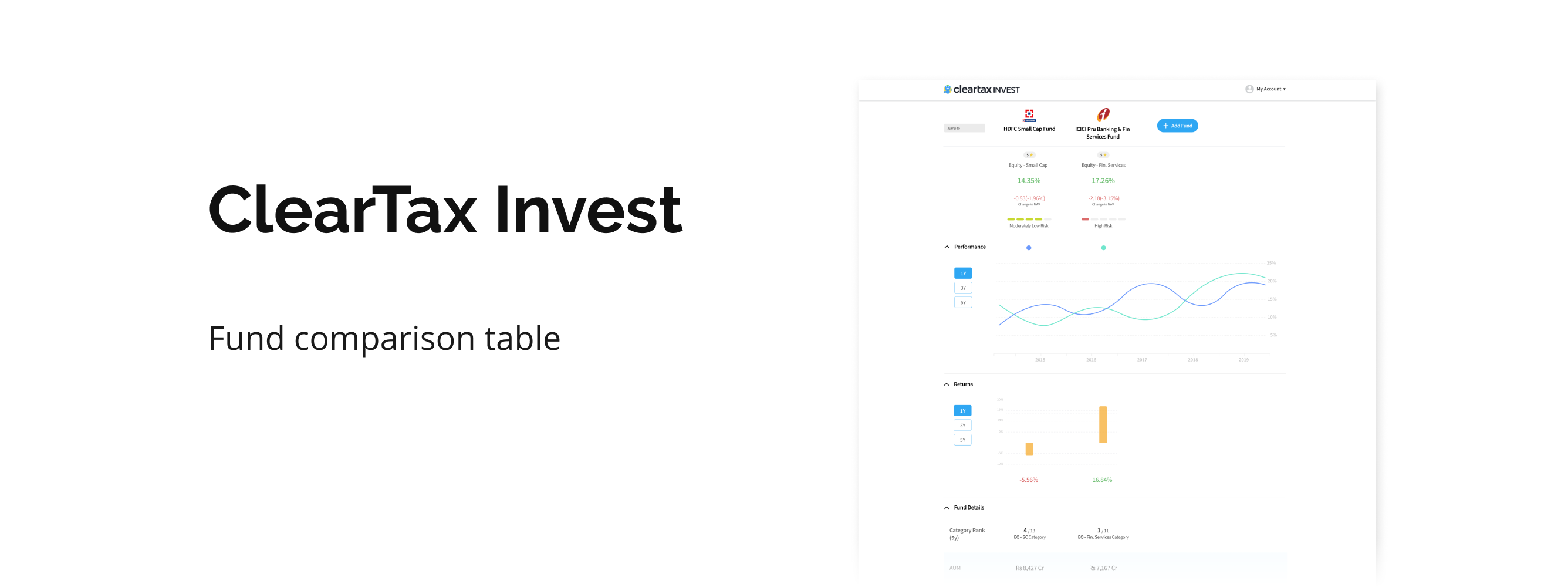

Cleartax Invest is Cleartax's mutual fund investment portal to buy or invest in direct mutual funds from various asset management companies. It shows various insights about the funds to help users in deciding which fund to invest in.
Before coming to Cleartax, I had very little knowledge about mutual funds. So I dedicated the first week of my internship learning about them - what they exactly were and how they worked.
In a nutshell, mutual funds are made up of money pooled in by a large number of people(having similar investment goals). Fund managers invest this money in a variety of stocks, bonds, and other financial instruments. Based on the instruments in which money is invested, mutual funds are segregated into equity funds, debt funds, hybrid funds. Based on the capitalization of companies in whose stocks, the majority of the fund is invested, mutual funds are divided into high-cap, mid-cap & low-cap funds.
The purpose of the user interviews was to understand what is the user's overall process of deciding to invest in a fund, what all Information do they look for in a fund page before investment, and what triggers them to invest.
And then came the most challenging part- interviewing the users. I was a bit intimidated, at first, by the idea of talking to users of an actual company But after a couple of calls and realizing how important these calls were for the effectiveness of the final product, I got the hang of it. Overall we called around 100 users and were able to collect data from around 60-70 users.
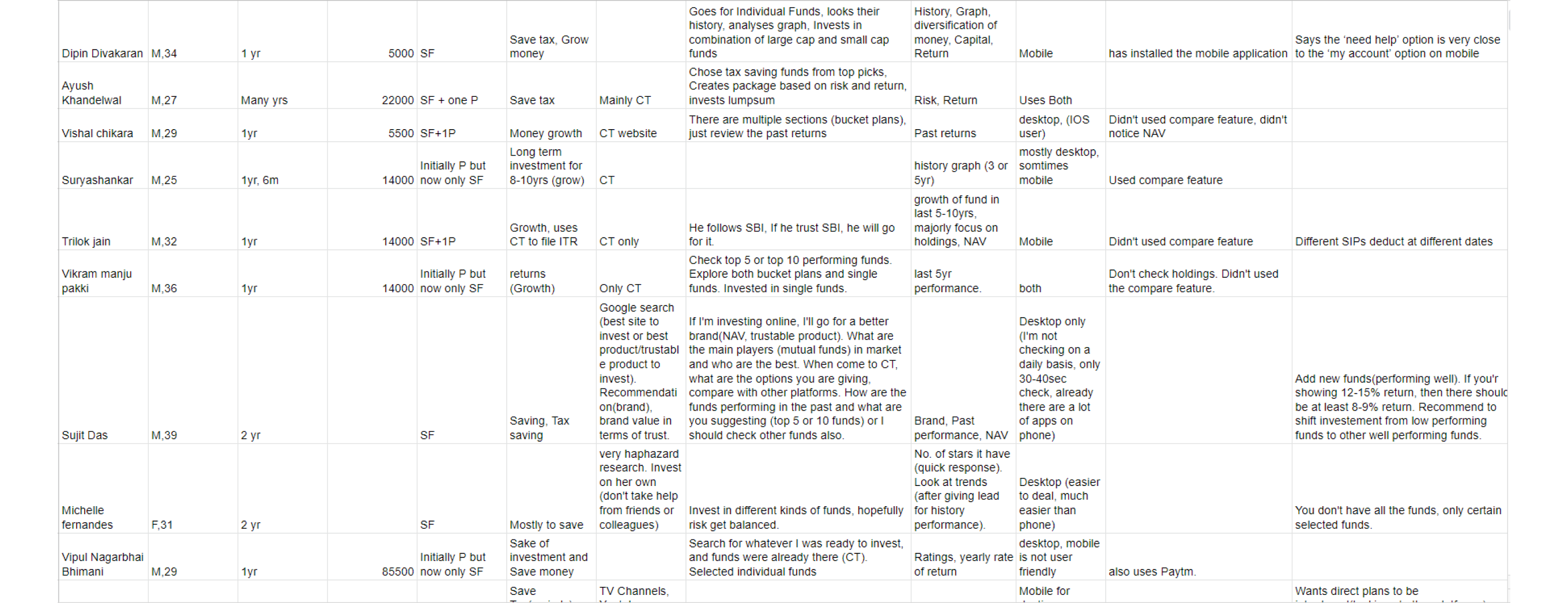
Compiling all the data in an excel sheet.
Nobody wants to make bad decisions, especially when investments are considered as they involve quite a lot of money. Therefore comparison is one of the most critical activities users perform on the web.
On Cleartax, most users do this by viewing across the details-page of various funds, which makes them remember a lot of information, thus increasing the cognitive load and also increases the interaction cost. So here comes the comparison table into the play. They provide a side by side comparison of products by providing all the necessary information on a single page. Comparison tables work on the compensatory decision-making process, i.e., users might accept a negative attribute as a tradeoff for a more positive one.
This was a major decision I had to take before heading on to the wireframes. The current design uses a horizontal table with product attributes in the columns.
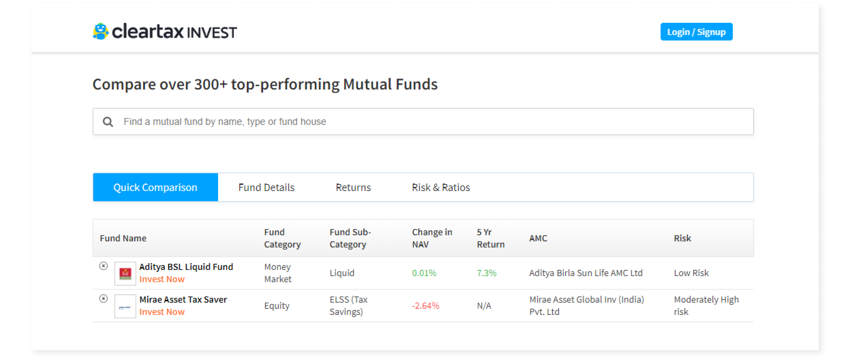
Existing design
One of the major pros of the horizontal layout is that the user can add any number of funds to compare. So I went to some of the power investors in the office to get an idea of how many funds they compare in general. They said that mostly they need to decide between 2-3 (max 4) funds, usually in the same category. There was my answer. I decided to go with the vertical layout.
Both the latter type of users use the compare feature. So I needed to prioritize the information so that it serves both kinds of users effectively without leaving the ones with less financial knowledge clueless. This is where my research helped me. With the help of the data collected, I sorted the metrics based on the amount of expertise required to understand that metric.
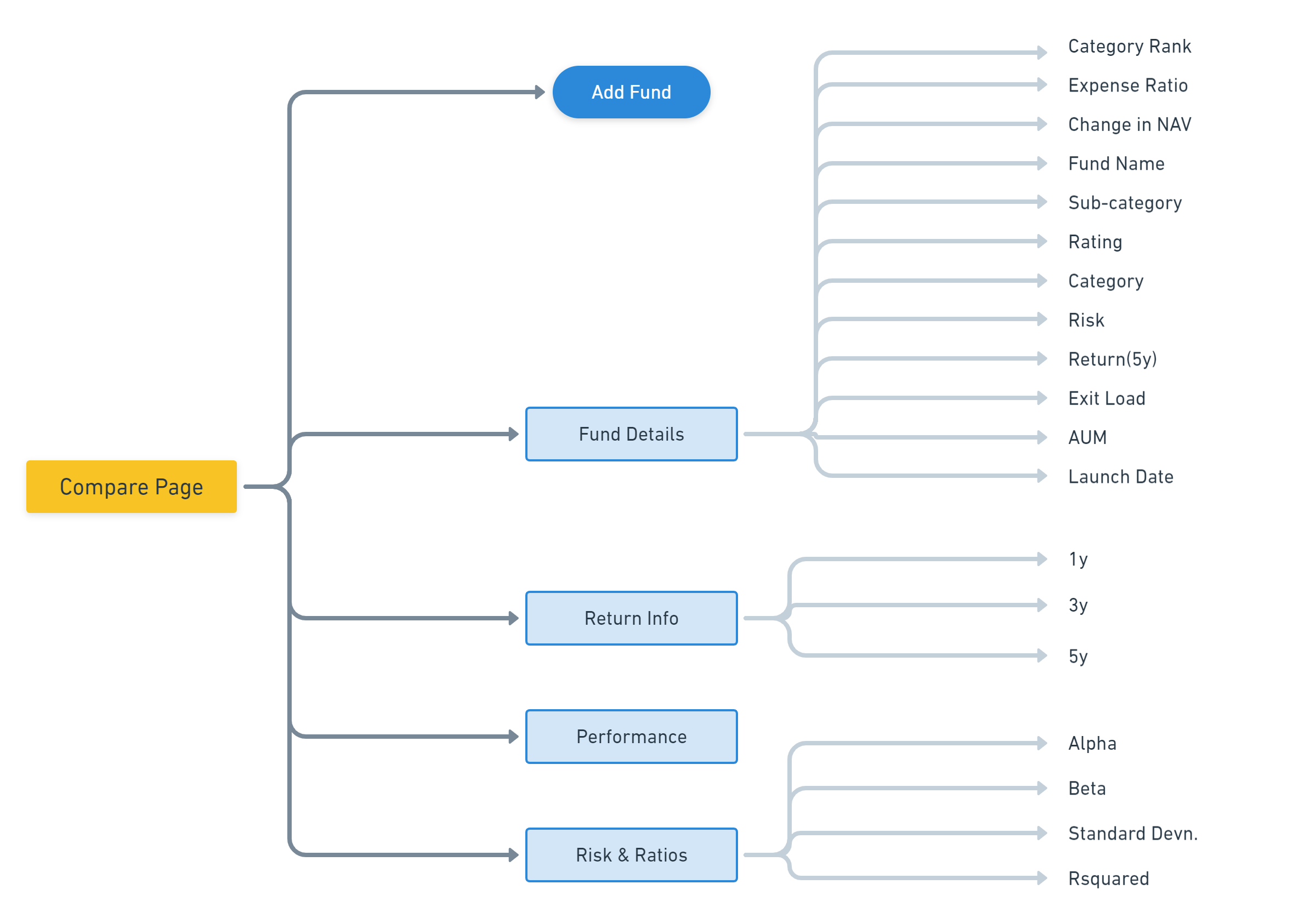
Information Architecture of comparison table.
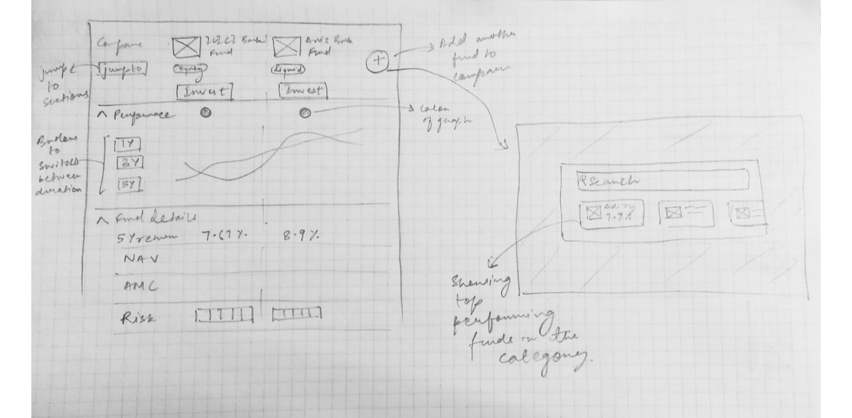
I made the table more scannable by accompanying data with easy-to-understand visual elements.
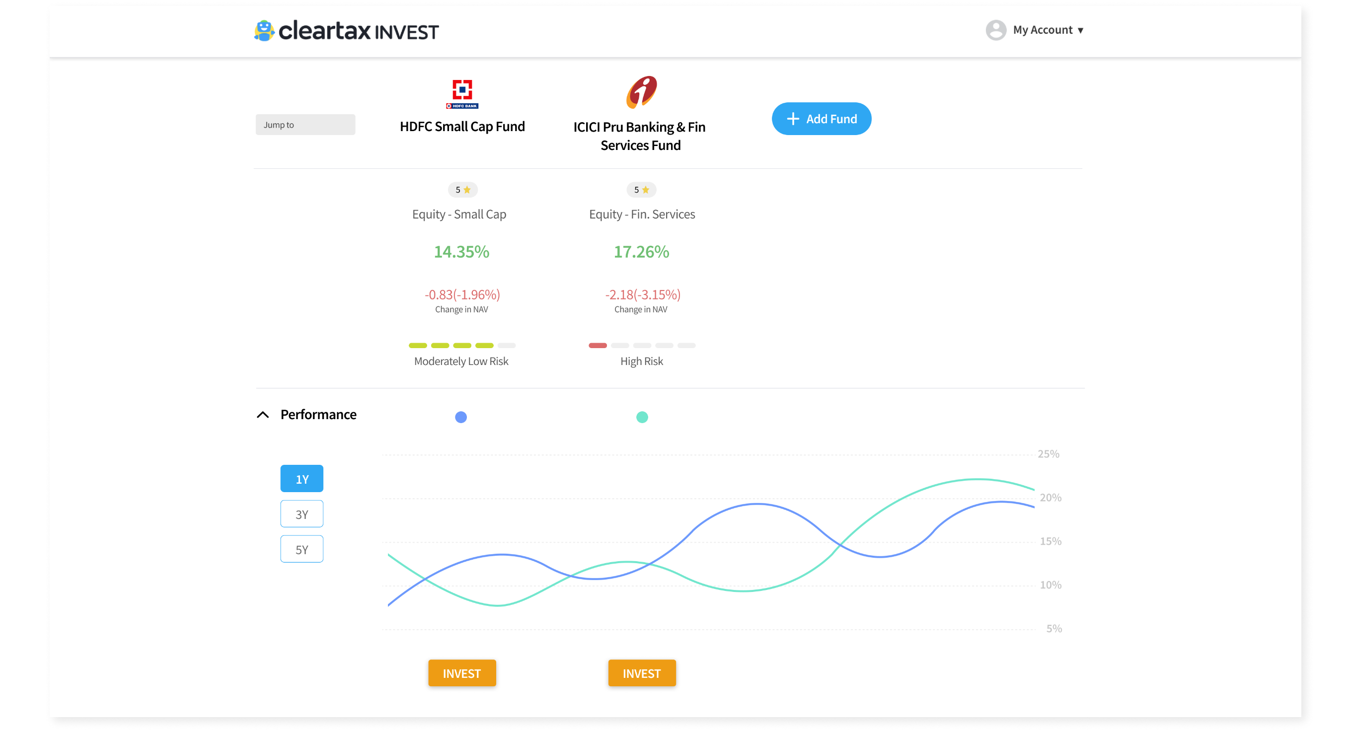
New design of Fund Comparison page
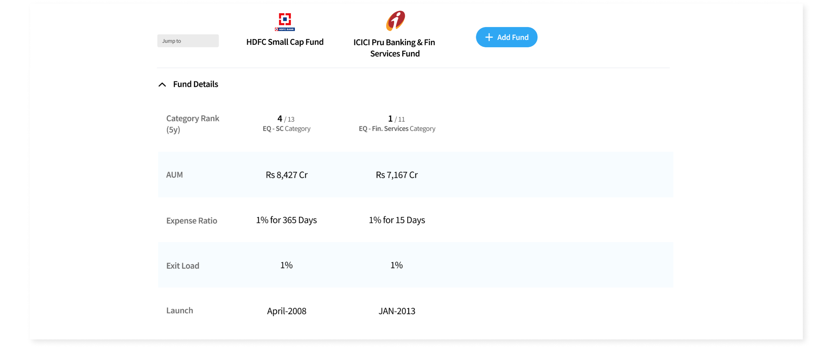
Fund details section

Returns section
The Risks and Ratios section was made for expert investors as these are some advanced metrics. So I included information about these with how they are effecting the fund so that amateur users can also understand them.
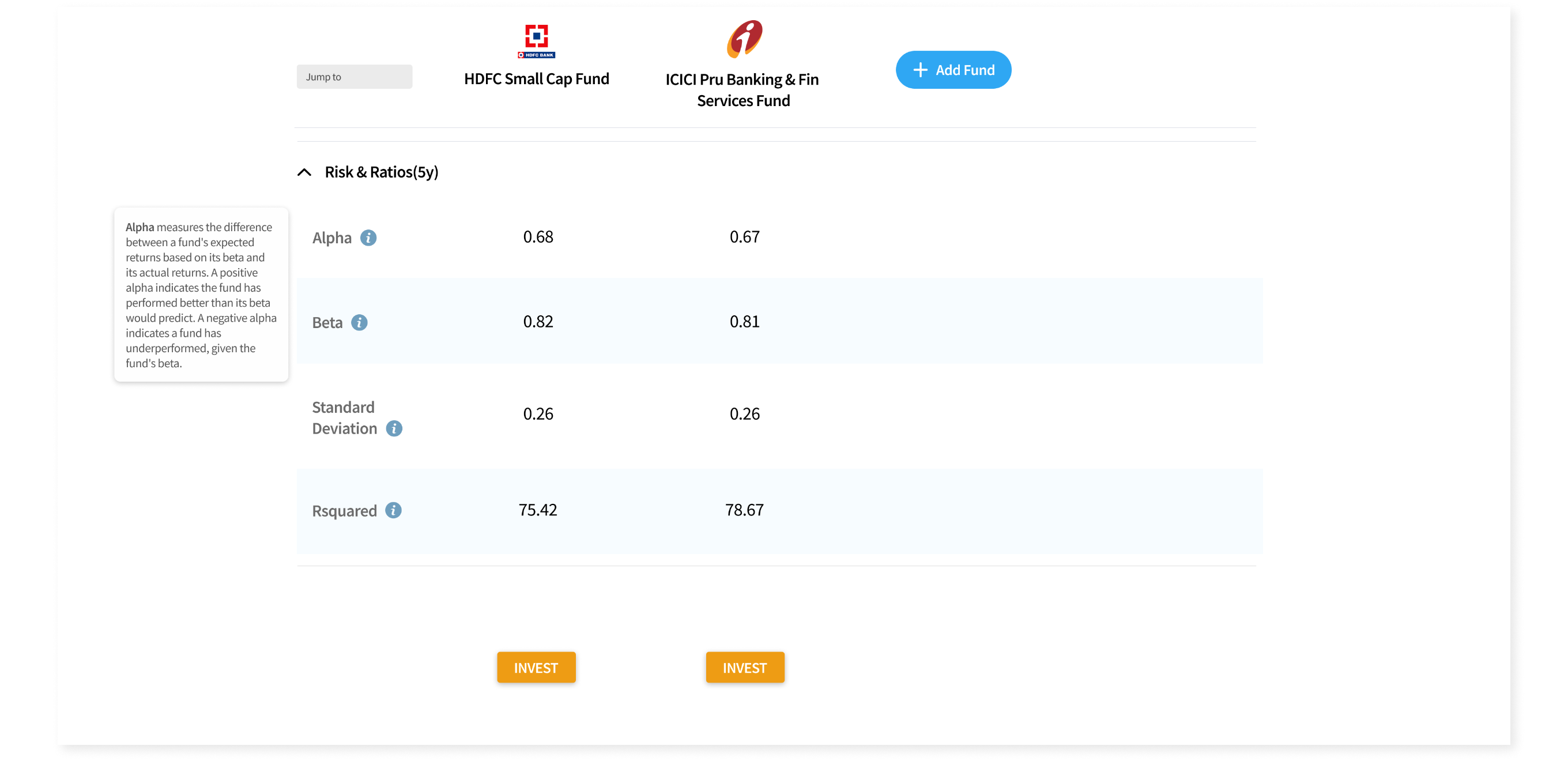
Risk and Ratios section.
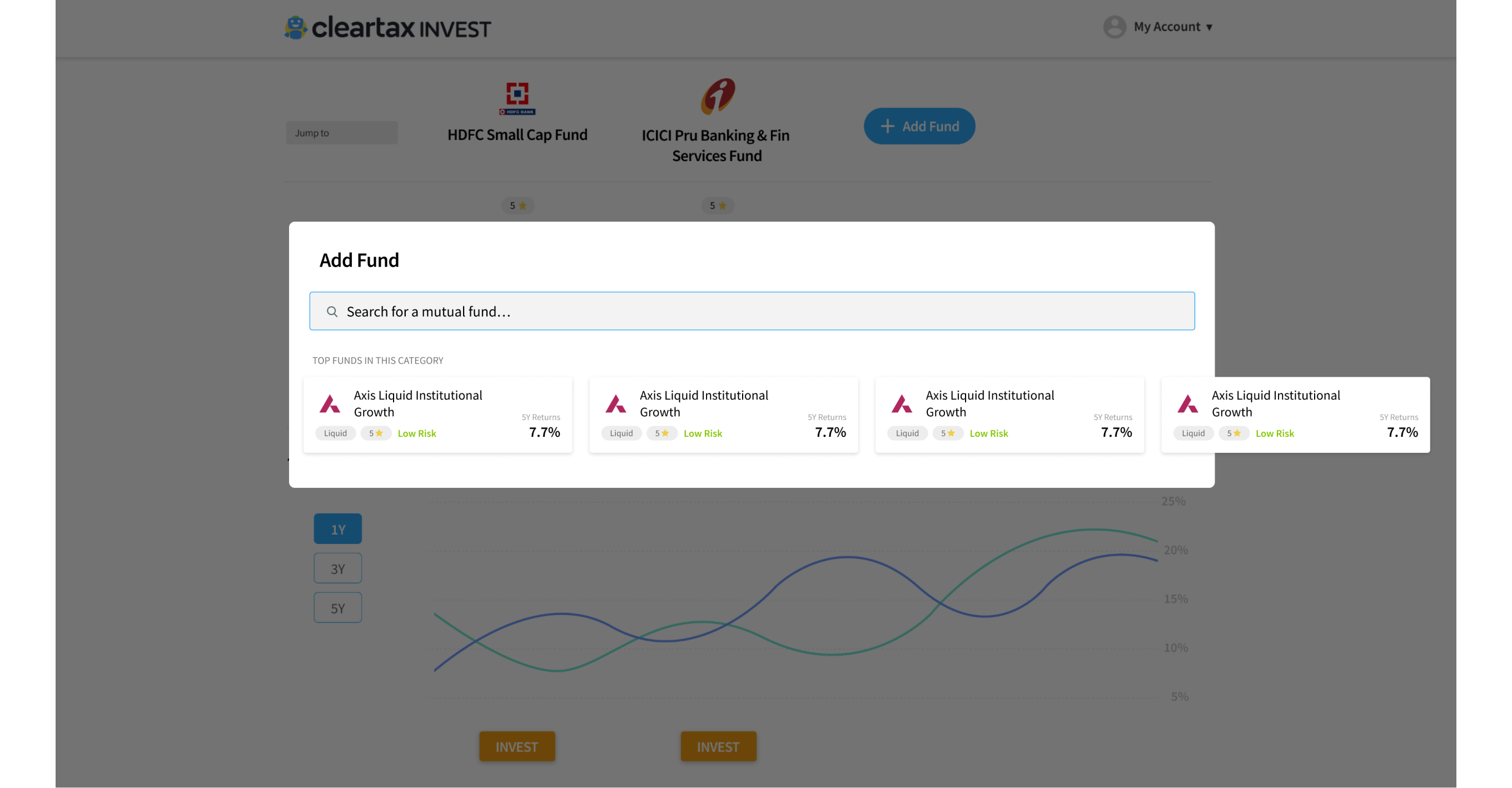
Modal to add fund. The user can also select from the top performing funds in the category being compared.
In the existing design, the compare feature was below the first fold and hidden between a lot of data. This was the reason why a lot of users didn't know that this feature existed.
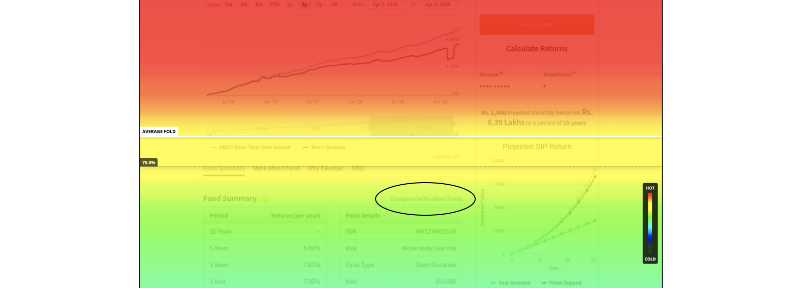
Scroll heatmap of a fund details page.
To tackle this, I proposed to shift the link just below the title of the fund to make it more discoverable.
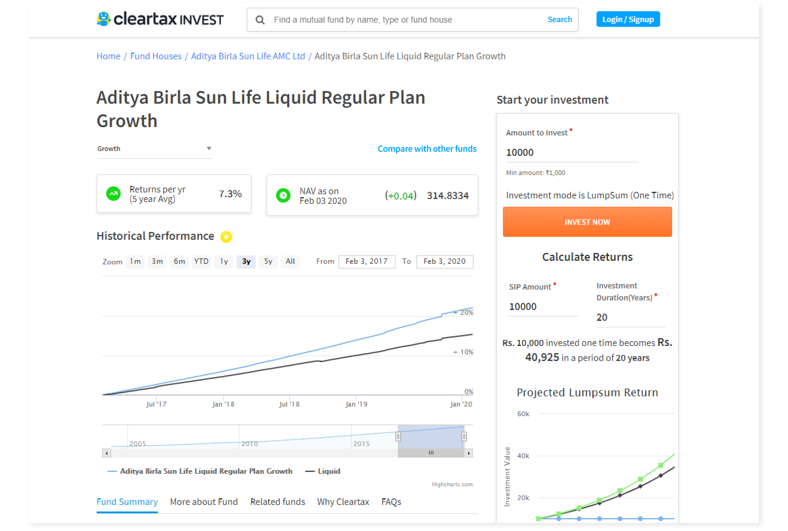
Shifting the compare link at the top.
My internship at ClearTax was my first industry experience in the field of UX design, and I was able to watch how things are done on a professional level. The amount of research going into designing even the smallest of things was quite intriguing.
Talking to the users was a bit challenging for me, but I accepted it and therefore got more useful insights.
It was the first time I was working with product managers, and everyone knows how they treat deadlines. So I learned how to work under pressure and meet deadlines but, at the same time, not compromise with the quality of the product.
Whatever knowledge I have now about the mutual funds and income tax, or the finance world in general, I owe it to ClearTax. This is another thing I love about design. By working on various projects, you get to learn about so many varied fields.
Also, I acquired some pretty awesome skills in darts and ping-pong :D.